
Article
Lesson content
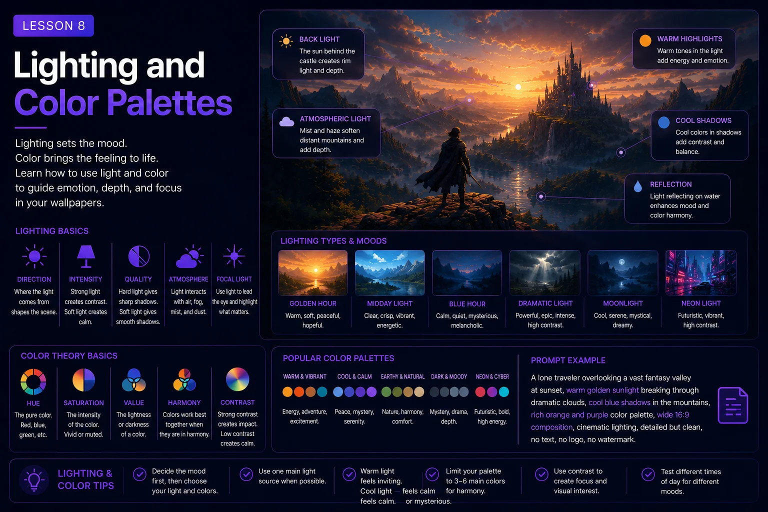
Lighting and Color Palettes
Lighting and color are two of the strongest tools in AI wallpaper prompting.
They can make the same subject feel peaceful, dramatic, futuristic, nostalgic, cozy, dark, magical, or cinematic. They also affect how readable the final wallpaper is on a real screen.
A wallpaper with good lighting and a strong color palette feels polished. A wallpaper with random lighting or noisy colors can feel messy, flat, or uncomfortable to use.
In this lesson, you will learn how to guide lighting and color choices in your prompts so your AI-generated wallpapers look clearer, more intentional, and more Skinbase-ready.
Why Lighting Matters
Lighting controls how the viewer sees the image.
It affects:
Mood
Depth
Focus
Contrast
Atmosphere
Readability
Subject visibility
Overall polish
A simple image can become much stronger when the lighting is clear.
Basic prompt:
A castle in the mountains.
Improved with lighting:
A castle in the mountains at sunrise, soft golden light touching the towers, mist glowing in the valley, wide 16:9 desktop wallpaper composition.
The second prompt gives the AI a stronger visual direction.
Lighting helps answer the question:
What should the viewer feel when they see this wallpaper?
Common Lighting Types
Different lighting types create different emotions.
Sunrise Lighting
Sunrise lighting often feels peaceful, hopeful, fresh, and warm.
Useful phrases:
soft sunrise lighting
warm golden morning light
first light of dawn
glowing horizon
mist lit by sunrise
Example:
A peaceful mountain lake at sunrise, soft golden morning light, gentle mist above the water, wide 16:9 desktop wallpaper, calm natural atmosphere, no text, no watermark.
Sunset Lighting
Sunset lighting often feels dramatic, nostalgic, romantic, or cinematic.
Useful phrases:
golden sunset light
orange and violet sky
warm evening glow
dramatic sunset rim lighting
glowing clouds at dusk
Example:
A lone samurai standing on a hill at sunset, warm orange and violet sky, dramatic rim lighting, wide 16:9 wallpaper composition, strong silhouette, no text, no watermark.
Moonlight
Moonlight often feels mysterious, calm, lonely, magical, or dark.
Useful phrases:
cold moonlight
soft blue moonlit atmosphere
full moon glow
silver light on the landscape
quiet night lighting
Example:
A white wolf standing on a snowy ridge under a full moon, soft blue moonlight, calm winter atmosphere, wide 16:9 desktop wallpaper, no cropped body, no text, no watermark.
Neon Lighting
Neon lighting is useful for sci-fi, cyberpunk, futuristic cities, robots, and night scenes.
Useful phrases:
neon blue and pink lighting
cyan and violet glow
neon reflections on wet pavement
glowing holographic signs
futuristic city lights
Example:
A rainy cyberpunk street at night, neon blue and pink reflections on wet pavement, one lone figure in the distance, wide 16:9 desktop wallpaper, clean dark space on the left, no readable text, no watermark.
Dramatic Lighting
Dramatic lighting creates strong contrast and a cinematic feeling.
Useful phrases:
dramatic side lighting
high contrast light and shadow
cinematic rim light
storm lighting
strong silhouette lighting
Example:
A heroic fantasy warrior standing on a mountain pass, dramatic sunset rim lighting, glowing clouds behind the silhouette, wide 16:9 wallpaper composition, full body visible, no text, no watermark.
Soft Diffused Lighting
Soft diffused lighting creates a gentle, calm, comfortable look.
Useful phrases:
soft diffused light
gentle overcast lighting
smooth natural light
soft glow
low contrast lighting
Example:
A cozy fantasy village in autumn, soft diffused evening light, warm windows glowing, falling leaves, wide 16:9 desktop wallpaper, painterly illustration style, no text, no watermark.
Lighting Should Support the Subject
The lighting should match the subject and scene.
A peaceful lake works well with:
soft sunrise light
gentle mist
warm golden reflections
calm blue shadows
A dark castle works well with:
cold moonlight
storm clouds
lightning glow
deep shadows
A cyberpunk city works well with:
neon reflections
wet pavement
blue and pink glow
dark atmospheric sky
A retro pixel-art scene works well with:
strong color blocks
limited palette lighting
bright horizon glow
simple readable highlights
Example of mismatched lighting:
A cozy autumn cottage with harsh horror lighting, neon cyberpunk glow, and bright tropical sunlight.
This mixes too many lighting ideas.
Better:
A cozy autumn cottage in a quiet forest, warm window light, soft evening glow, gentle rain, painterly fantasy style, wide 16:9 wallpaper, no text, no watermark.
Choose one main lighting direction and let it support the mood.
Use Lighting to Create Depth
Lighting can make an image feel more three-dimensional.
Useful depth phrases:
atmospheric depth
soft light fading into the distance
backlit mist
glowing horizon
foreground in shadow
distant mountains lit by sunrise
rim light around the subject
layered light and shadow
Example:
A fantasy valley at sunrise, foreground rocks in soft shadow, distant castle glowing in golden light, misty mountains in the background, wide 16:9 desktop wallpaper, atmospheric depth, no text, no watermark.
This helps the wallpaper feel spacious and cinematic.
Use Lighting to Guide Attention
Lighting can tell the viewer where to look.
A bright subject against a darker background becomes the focus. A dark silhouette against a glowing sky can also become very readable.
Useful phrases:
main subject softly illuminated
glowing focal point
strong readable silhouette
background darker than the subject
light leading toward the subject
rim light around the character
bright portal as the focal point
Example:
A glowing magical portal in ancient forest ruins, portal as the main light source, soft blue light illuminating the stones, dark forest background, wide 16:9 wallpaper composition, no text, no watermark.
The lighting creates a clear focal point.
Why Color Palettes Matter
A color palette is the set of colors used in the image.
Good color palettes make wallpapers feel more polished and easier to look at. Random colors can make an image noisy or confusing.
Color affects:
Mood
Style
Readability
Genre
Visual identity
Desktop comfort
Thumbnail impact
A strong color palette helps the image feel intentional.
Basic prompt:
A futuristic city.
Improved with color palette:
A futuristic city skyline at night, neon blue and violet color palette, glowing towers, clean dark sky, wide 16:9 desktop wallpaper, cinematic sci-fi atmosphere, no readable text, no watermark.
The color palette gives the image a clearer identity.
Warm Color Palettes
Warm colors include red, orange, yellow, gold, peach, and warm brown.
Warm palettes often feel:
cozy
hopeful
romantic
nostalgic
magical
energetic
sunset-like
Useful phrases:
warm golden palette
orange and violet sunset
cozy amber light
autumn orange and brown tones
soft peach and gold colors
warm cinematic highlights
Example:
A peaceful fantasy village at sunset, warm golden color palette, glowing windows, soft orange sky, cozy painterly illustration style, wide 16:9 desktop wallpaper, no text, no watermark.
Warm colors are great for cozy fantasy, sunset landscapes, autumn scenes, villages, and nostalgic wallpapers.
Cool Color Palettes
Cool colors include blue, cyan, teal, violet, gray, and green-blue.
Cool palettes often feel:
calm
futuristic
mysterious
lonely
quiet
cinematic
peaceful
Useful phrases:
calm blue and teal palette
cool blue moonlit tones
cyan and violet sci-fi colors
soft blue-gray atmosphere
muted cool color palette
deep navy background with subtle glow
Example:
A lonely spaceship above a blue alien planet, cool blue and teal color palette, large dark starfield, cinematic sci-fi atmosphere, wide 16:9 desktop wallpaper, no text, no watermark.
Cool colors are useful for sci-fi, night scenes, winter landscapes, ocean scenes, and calm wallpapers.
Dark Color Palettes
Dark palettes can feel dramatic, elegant, gothic, mysterious, or powerful.
Useful phrases:
dark blue-gray palette
black and silver tones
deep shadows with subtle highlights
gothic muted colors
dark cinematic atmosphere
low-key lighting
Example:
A ruined gothic cathedral in a black forest, dark blue-gray color palette, cold moonlight, thick fog, wide 16:9 desktop wallpaper, dark fantasy concept art, no text, no watermark.
Dark palettes work well for dramatic wallpapers, but be careful. If the image is too dark, important details may disappear on screen.
Add phrases like:
readable silhouette
subtle highlights
clear focal point
balanced contrast
Bright Color Palettes
Bright palettes can feel energetic, playful, dreamy, or surreal.
Useful phrases:
bright cheerful colors
vivid fantasy palette
glowing pastel colors
saturated neon palette
colorful dreamlike atmosphere
vibrant but balanced colors
Example:
A dreamy fantasy sky with floating islands, vibrant pastel color palette, soft glowing clouds, wide 16:9 desktop wallpaper, clean open composition, no text, no watermark.
Bright palettes can look beautiful, but avoid making the image too noisy.
Useful control phrases:
balanced saturation
clean color harmony
not oversaturated
soft contrast
limited bright accents
Limited Color Palettes
A limited color palette uses only a small number of main colors.
This can make wallpapers feel cleaner and more professional.
Useful phrases:
limited color palette
three-color palette
restrained color scheme
minimal color palette
muted palette with one accent color
dark background with cyan highlights
Example:
A minimal abstract wallpaper with smooth dark navy gradients and one glowing cyan wave, limited color palette, wide 16:9 desktop wallpaper, clean negative space, no text, no logo, no watermark.
Limited palettes are especially useful for:
Abstract wallpapers
Pixel art
Minimal designs
Retro computer art
Clean sci-fi scenes
Desktop-friendly backgrounds
Color and Readability
A wallpaper should not only look impressive. It should also be comfortable to use.
Too much contrast can be harsh. Too many bright colors can become tiring. Too many similar colors can make the subject hard to see.
Good wallpaper color prompts often include:
balanced contrast
readable subject
clean color separation
soft background colors
strong silhouette
calm negative space
not oversaturated
limited visual noise
Example:
A futuristic robot standing on a rooftop, cool blue and violet palette, robot clearly separated from the darker city background, subtle rim light, wide 16:9 desktop wallpaper, clean negative space, no text, no watermark.
This prompt uses color and lighting to improve readability.
Avoid Color Noise
Color noise happens when an image has too many competing colors or random bright details.
This is common in AI images, especially fantasy, cyberpunk, and abstract prompts.
Weak prompt:
A colorful magical city with rainbow lights, glowing signs, fire, crystals, flowers, stars, neon, explosions, and colorful fog everywhere.
Cleaner prompt:
A magical city at twilight, blue and gold color palette, glowing windows, soft mist, wide 16:9 desktop wallpaper, detailed but uncluttered, balanced color harmony, no text, no watermark.
A good wallpaper can be colorful without being chaotic.
Pair Lighting and Color Together
Lighting and color work best when they support each other.
Good combinations:
Peaceful nature wallpaper
soft sunrise lighting, warm golden and pale blue palette
Cyberpunk wallpaper
neon blue and pink lighting, dark navy background
Dark fantasy wallpaper
cold moonlight, blue-gray and black palette
Cozy fantasy wallpaper
warm window light, amber and autumn brown palette
Retro pixel-art wallpaper
limited 16-color or 32-color palette, strong clean highlights
Sci-fi space wallpaper
cool blue rim light, black starfield, cyan accents
Example:
A cozy autumn street in a fantasy village, warm amber window light, muted orange and brown palette, soft evening rain, wide 16:9 desktop wallpaper, painterly illustration style, no text, no watermark.
The lighting and palette tell the same emotional story.
Lighting Mistakes to Avoid
Mistake 1: No Lighting Direction
Weak:
A mountain landscape wallpaper.
Better:
A mountain landscape at sunrise, soft golden light on the peaks, mist in the valley, wide 16:9 desktop wallpaper, no text, no watermark.
Mistake 2: Too Many Lighting Types
Weak:
A forest with sunrise, moonlight, neon lights, fire glow, lightning, and candlelight.
Better:
A magical forest at night, soft blue moonlight, glowing mushrooms, gentle mist, wide 16:9 wallpaper, no text, no watermark.
Mistake 3: Lighting That Hides the Subject
Weak:
A warrior in total darkness.
Better:
A warrior in a dark forest, subtle blue rim light around the silhouette, face softly visible, wide 16:9 wallpaper, no text, no watermark.
Color Mistakes to Avoid
Mistake 1: Too Many Colors
Weak:
A rainbow cyberpunk city with every color, glowing everything, colorful lights everywhere.
Better:
A cyberpunk city at night, neon cyan and magenta palette, dark navy sky, wet streets with controlled reflections, wide 16:9 wallpaper, no readable text, no watermark.
Mistake 2: No Palette Direction
Weak:
A beautiful fantasy lake.
Better:
A beautiful fantasy lake with a soft blue and gold palette, sunrise reflections, gentle mist, wide 16:9 desktop wallpaper, no text, no watermark.
Mistake 3: Overly Harsh Contrast
Weak:
Extremely high contrast black and white fantasy landscape with bright glowing details everywhere.
Better:
A dark fantasy landscape with balanced contrast, soft silver moonlight, black and blue-gray palette, readable castle silhouette, wide 16:9 wallpaper, no text, no watermark.
Before and After Example
Basic prompt:
A sci-fi city wallpaper.
This gives no lighting or color direction.
Improved prompt:
A futuristic sci-fi city skyline at night, neon blue and violet color palette, glowing towers reflected on wet rooftops, city placed in the lower third, large clean dark sky above, cinematic lighting, wide 16:9 desktop wallpaper, detailed but uncluttered, no readable text, no logo, no watermark.
The improved prompt controls:
Time of day
Lighting type
Color palette
Mood
Readability
Composition
Restrictions
Now the image has a stronger visual identity.
Beginner Lighting and Color Formula
Use this formula when writing wallpaper prompts:
Subject + scene + lighting type + color palette + mood + composition + style + restrictions
Example:
A lonely lighthouse on a rocky coast, soft blue-gray morning light, muted cool color palette, quiet melancholic mood, wide 16:9 desktop wallpaper composition, lighthouse placed on the right third, large foggy sky on the left, realistic digital painting style, no text, no logo, no watermark.
This formula helps your image feel intentional and screen-friendly.
Quick Lighting Phrase Library
Use these phrases as starting points:
Peaceful
soft sunrise lighting, gentle mist, warm golden reflections
Dramatic
cinematic rim light, storm clouds, high contrast shadows
Mysterious
cold moonlight, thick fog, deep blue shadows
Cozy
warm window light, soft evening glow, amber highlights
Futuristic
neon blue and violet glow, reflective surfaces, cool rim light
Dreamy
soft pastel glow, diffused light, floating light particles
Dark Fantasy
low-key lighting, silver moonlight, subtle highlights in deep shadow
Quick Color Palette Library
Use these palette ideas when you need direction:
Warm fantasy
gold, amber, orange, soft brown
Cool sci-fi
cyan, blue, violet, dark navy
Dark gothic
black, blue-gray, silver, muted purple
Cozy autumn
orange, brown, warm yellow, muted red
Peaceful nature
soft green, pale blue, warm gold
Cyberpunk
neon cyan, magenta, violet, deep black
Retro pixel art
limited 16-color palette, strong contrast, clean color blocks
Minimal abstract
dark navy, soft gray, one bright accent color
Skinbase Creator Tip
Lighting and color can make your Skinbase upload easier to title, tag, and discover.
A wallpaper with clear blue moonlight might use tags like:
moonlight
blue
night
fantasy
atmospheric
A warm autumn scene might use:
autumn
cozy
warm-light
village
fantasy
A neon city scene might use:
cyberpunk
neon
sci-fi
city
night
When the lighting and palette are clear, the artwork feels more complete and easier to present.
Practice Exercise
Start with this simple idea:
A forest path.
Now create three lighting and color versions.
Peaceful sunrise version:
A forest path at sunrise, soft golden light shining through tall trees, gentle mist, warm green and gold palette, calm natural atmosphere, wide 16:9 desktop wallpaper, no text, no watermark.
Mysterious moonlight version:
A forest path at night, cold blue moonlight, thick fog between ancient trees, dark blue-gray palette, mysterious atmosphere, wide 16:9 desktop wallpaper, no text, no watermark.
Magical fantasy version:
A forest path filled with glowing blue mushrooms, soft violet moonlight, blue and purple fantasy palette, dreamy magical atmosphere, wide 16:9 desktop wallpaper, detailed but uncluttered, no text, no watermark.
Now choose your own subject and write three different lighting and color versions.
Key Takeaways
Lighting and color palettes help control the mood, readability, and polish of your AI wallpapers.
To use them well:
Choose one main lighting direction.
Match lighting to the subject and mood.
Use color palettes intentionally.
Avoid too many competing colors.
Use contrast to improve readability.
Pair lighting and color so they tell the same story.
Keep the final wallpaper comfortable for screen use.
Strong lighting and color can turn a simple prompt into a memorable Skinbase-ready wallpaper.
In the next lesson, you will learn how to write better fantasy wallpaper prompts using the structure, composition, mood, lighting, and style ideas from this course.
Lesson navigation
Continue in order
Previous lesson
Wallpaper Prompt Engineering for Skinbase Creators · Lesson 07
Composition for Wallpapers
Learn how to arrange subjects, space, and detail so AI-generated images work better as wallpapers.
Next lesson
Wallpaper Prompt Engineering for Skinbase Creators · Lesson 09
Writing Better Fantasy Wallpaper Prompts
Learn how to create stronger fantasy wallpaper prompts with clearer worlds, magical atmosphere, composition, lighting, and style direction.