
Article
Lesson content
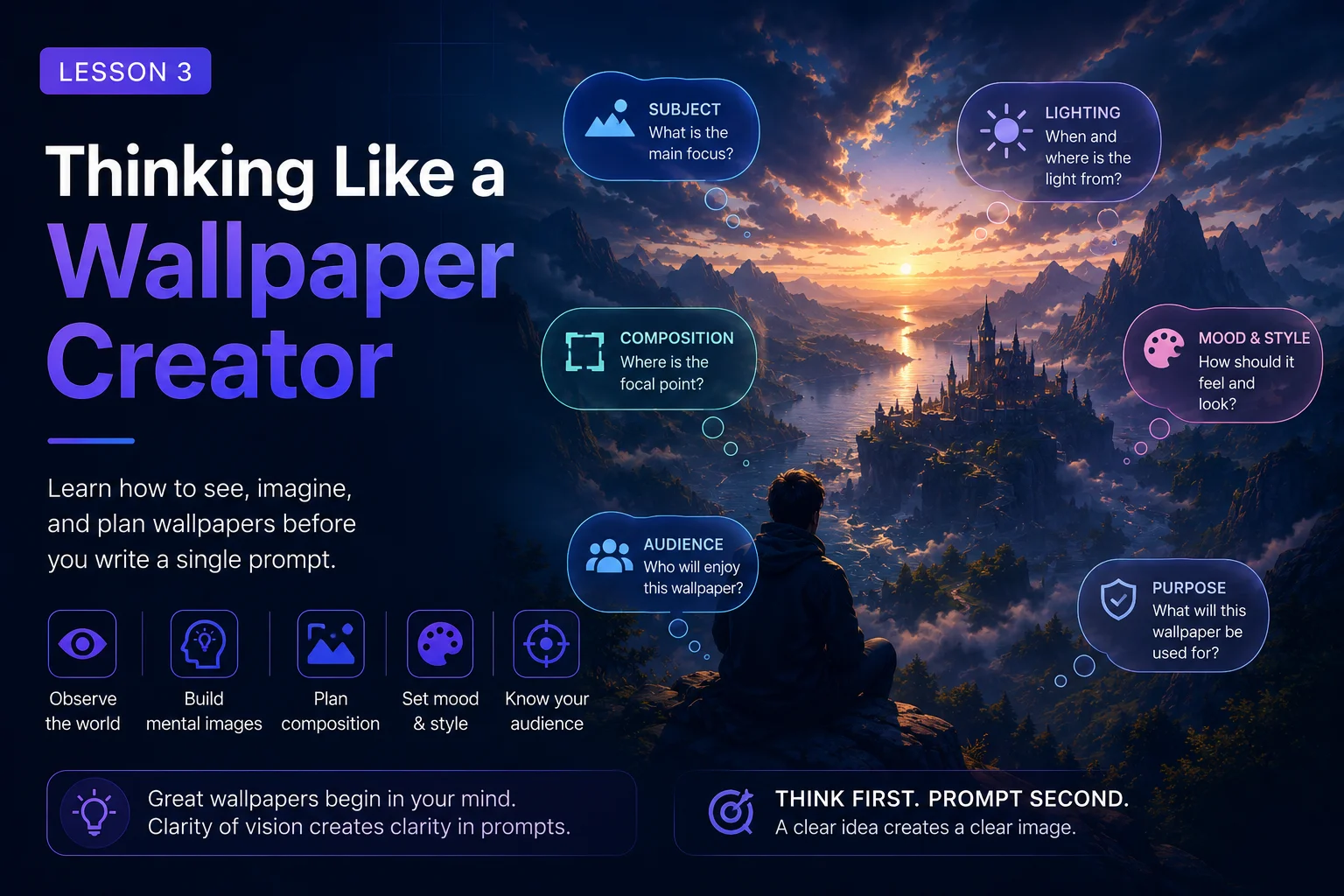
Thinking Like a Wallpaper Creator
A wallpaper is not just an image.
A wallpaper is an image that lives behind icons, windows, widgets, menus, and app shortcuts. It must look good when viewed full-screen, but it also needs to remain comfortable when used every day.
Many AI images are beautiful as standalone artworks, but they fail as wallpapers. They may be too busy. The subject may be too close to the edge. The colors may fight with desktop icons. Important details may disappear behind app shortcuts. The image may look impressive in a gallery thumbnail but feel uncomfortable as a background.
Thinking like a wallpaper creator means designing the image for real screen use from the beginning.
In this lesson, you will learn how to guide AI tools toward cleaner, more usable wallpaper images.
A Wallpaper Needs Breathing Room
One of the biggest differences between normal artwork and wallpaper is space.
A good wallpaper usually needs breathing room. This means the image should have areas that are calmer, softer, simpler, or less detailed.
These areas help the image feel usable. They also make it easier to see desktop icons, folders, widgets, and text.
Useful prompt phrases:
clean open space
soft background area
uncluttered sky
simple atmospheric background
wide empty area on the left
calm negative space
clear desktop icon area
Weak prompt:
A fantasy forest full of glowing mushrooms, fairies, dragons, ruins, rivers, flowers, magic lights, and animals.
Better wallpaper prompt:
A magical forest path with glowing blue mushrooms, wide 16:9 desktop wallpaper composition, soft fog between ancient trees, clean open space in the center, calm fantasy atmosphere, detailed but uncluttered, no text, no watermark.
The second version gives the image room to breathe.
Readability Matters
Readability means the image is easy to understand.
A wallpaper should usually be readable in a few seconds. The viewer should quickly understand the main subject, mood, and scene.
If the image contains too many competing details, the viewer may not know where to look.
Readable wallpapers often have:
One clear main subject
Strong silhouette
Simple background structure
Good contrast between subject and background
Clear foreground, midground, and background
Limited visual noise
Weak prompt:
A giant robot, spaceship battle, neon city, explosion, rain, crowds, flying cars, holograms, smoke, lightning, and soldiers.
Better wallpaper prompt:
A giant robot standing above a distant neon city at night, wide 16:9 sci-fi wallpaper, robot silhouette clearly visible against the glowing skyline, blue and violet lighting, atmospheric rain, detailed but not cluttered, no text, no logo.
The improved prompt still feels epic, but it gives the viewer one main focus.
Think About Desktop Icons
Many desktop users place icons on the left side of the screen. Some place them along the bottom or top. Mobile screens also have lock-screen text, clocks, widgets, and app icons.
A wallpaper does not need to be empty, but it should not be visually chaotic everywhere.
For desktop wallpapers, you can guide the AI with phrases like:
clean space on the left for desktop icons
large open sky area
simple dark gradient on the left
uncluttered area around the edges
subject placed on the right third
Example:
A futuristic city skyline at night, wide 16:9 desktop wallpaper, city lights concentrated on the right side, clean dark sky area on the left for desktop icons, neon blue and purple atmosphere, detailed but uncluttered, no text, no watermark.
This kind of prompt intentionally leaves usable space.
Aspect Ratio Changes Everything
Aspect ratio describes the shape of the image.
A desktop wallpaper is usually wide. A mobile wallpaper is usually vertical. A banner, cover image, and gallery thumbnail may each need different framing.
Common desktop ratios:
16:9
16:10
21:9
Common mobile ratios:
9:16
3:4
4:5
If you want a desktop wallpaper, include this in the prompt:
wide 16:9 desktop wallpaper composition
If you want a phone wallpaper, use:
vertical 9:16 mobile wallpaper composition
If you do not mention the aspect ratio, the AI may create a beautiful image in the wrong format. Cropping it later can cut off important details.
Composition Should Match the Screen
Composition is how everything is arranged inside the image.
For wallpapers, composition is not only about beauty. It is also about usability.
Good wallpaper composition can include:
Subject on the right third
Subject on the lower third
Distant centered subject
Large sky area
Soft background gradients
Calm empty edges
Strong horizon line
Clear depth from foreground to background
Useful phrases:
wide cinematic composition
subject placed on the right third
landscape framing
large open sky
clean foreground
balanced layout
clear horizon line
strong readable silhouette
Example:
A lonely samurai standing on a hill at sunset, wide 16:9 wallpaper composition, subject placed on the right third, large warm sky on the left, distant mountains, clean silhouette, cinematic atmosphere, no text, no watermark.
This prompt creates an image that can work both as art and as a usable desktop background.
Avoid Edge Problems
AI tools often place important details too close to the image edge. This can make wallpapers feel awkward.
Common edge problems include:
Cropped heads
Cut-off hands
Half-visible animals
Weapons leaving the frame
Important buildings touching the edge
Main subject too close to the border
For character or creature wallpapers, add instructions like:
full body visible
complete subject inside the frame
no cropped head
no cut-off limbs
subject not touching the edges
centered with safe margins
Example:
A majestic white wolf standing on a snowy ridge, wide 16:9 wallpaper composition, full body visible, wolf placed slightly right of center with safe margins, moonlit mountain background, clean atmospheric snow, no cropped ears, no cut-off paws, no text, no watermark.
This helps protect the subject from bad cropping.
Less Clutter, More Impact
A common beginner mistake is thinking that more objects make the image better.
More objects can make the prompt sound exciting, but they can also make the final image confusing.
Instead of adding many things, focus on fewer stronger elements.
Weak prompt:
A fantasy scene with a wizard, dragon, castle, army, forest, river, moon, stars, fire, lightning, magical portal, glowing sword, mountains, and ancient ruins.
Cleaner wallpaper prompt:
A lone wizard standing before a glowing magical portal in ancient ruins, wide 16:9 fantasy wallpaper, large misty forest background, soft blue magical light, clear silhouette, detailed but uncluttered, no text, no watermark.
This version keeps the fantasy feeling but removes chaos.
A strong wallpaper usually needs one main idea, one strong mood, and a clean layout.
Use Negative Space Intentionally
Negative space is the empty or calmer area around the subject.
It does not mean the image is boring. It means the composition has balance.
Negative space can be:
Sky
Fog
Water
Smooth gradients
Empty desert
Soft forest shadows
Minimal abstract shapes
Blurred background
Dark atmospheric space
Example:
A small spaceship flying above a blue alien planet, wide 16:9 sci-fi wallpaper, spaceship in the upper-right third, large dark starfield as negative space, subtle nebula glow, clean composition, no text, no logo, no watermark.
Negative space helps wallpapers feel professional and usable.
Choose Colors That Work on a Screen
Very bright or noisy colors can become tiring when used as a wallpaper.
Good wallpaper colors are often balanced. They can be colorful, but they should not fight with the screen interface.
Useful color direction phrases:
balanced color palette
soft contrast
calm blue and violet tones
warm golden highlights
muted cinematic colors
dark background with subtle glow
clean gradient sky
limited color palette
Example:
A peaceful ocean sunset, wide 16:9 desktop wallpaper, soft orange and violet sky, gentle waves, clean horizon, balanced color palette, calm atmosphere, realistic digital painting, no text, no watermark.
For wallpapers, color should support long-term use, not just first-glance impact.
Wallpaper Prompt Checklist
Before generating your image, check your prompt.
Purpose
Is this for desktop, mobile, or gallery use?
Aspect ratio
Did I include 16:9, 9:16, or another format?
Main subject
Is there one clear focus?
Composition
Did I describe where the subject should be placed?
Clean space
Is there room for icons, widgets, or visual rest?
Readability
Can the image be understood quickly?
Clutter
Did I avoid too many objects?
Restrictions
Did I prevent text, logos, watermarks, bad cropping, or distorted anatomy?
If your prompt answers these questions, it is much more likely to create a usable wallpaper.
Before and After Example
Basic prompt:
A beautiful fantasy landscape.
This is too vague. It may generate a nice image, but it does not think like a wallpaper.
Improved prompt:
A peaceful fantasy landscape with a distant glowing castle beside a mountain lake, wide 16:9 desktop wallpaper composition, castle placed on the right third, large clean sky and lake reflection on the left, soft sunrise lighting, calm magical atmosphere, detailed but uncluttered, no text, no logo, no watermark.
The improved prompt adds:
Aspect ratio
Subject placement
Clean space
Lighting
Mood
Style direction
Restrictions
Now the image has a better chance of working as a real wallpaper.
Practice Exercise
Start with this simple idea:
A robot in a futuristic city.
Now think like a wallpaper creator.
Ask:
Where should the robot stand?
Should the city be detailed or distant?
Where should the clean space be?
Is it a desktop wallpaper or mobile wallpaper?
What colors should dominate?
What should be avoided?
Improved version:
A sleek robot standing on a rooftop above a futuristic city at night, wide 16:9 desktop wallpaper composition, robot placed on the right third with full body visible, large clean neon sky on the left for desktop icons, blue and purple lighting, cinematic sci-fi atmosphere, sharp silhouette, detailed but uncluttered, no text, no logo, no watermark, no cropped limbs.
Now create your own version using a different subject.
Key Takeaways
Thinking like a wallpaper creator means designing for real screen use.
A strong wallpaper prompt should consider:
Readability
Desktop or mobile space
Aspect ratio
Subject placement
Clean composition
Negative space
Balanced colors
Avoiding clutter
Avoiding bad cropping
A great wallpaper is not only beautiful. It is comfortable, usable, and clear.
In the next lesson, you will learn how to control the subject and scene more precisely so your prompts produce stronger, more intentional images.
Lesson navigation
Continue in order
Previous lesson
Wallpaper Prompt Engineering for Skinbase Creators · Lesson 02
The Anatomy of a Strong AI Art Prompt
Learn the main building blocks of a strong AI art prompt and how each part helps control the final wallpaper result.
Next lesson
Wallpaper Prompt Engineering for Skinbase Creators · Lesson 04
Controlling Subject and Scene
Learn how to describe the main subject and environment clearly without overloading your AI wallpaper prompt.