
Article
Lesson content
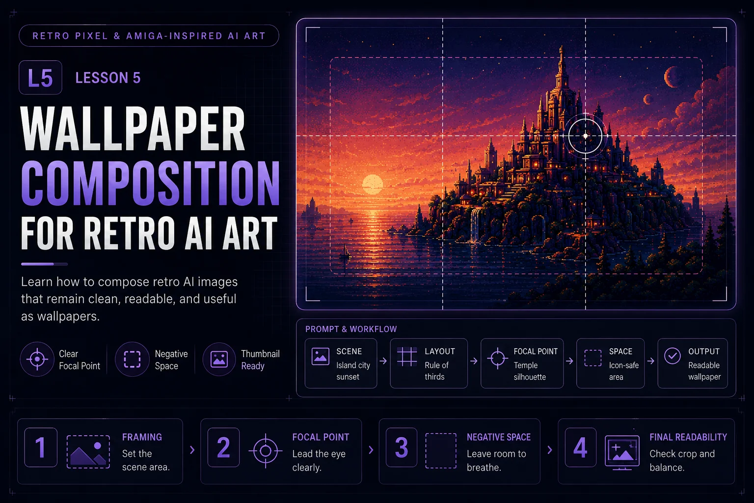
Wallpaper Composition for Retro AI Art
A strong retro AI image is not automatically a good wallpaper. A wallpaper needs space, balance, readability, and a clear focal point. It should look good full-size, but it should also remain recognizable as a small Skinbase gallery thumbnail.
In this lesson, you will learn how to compose retro AI artwork so it works as a practical wallpaper, not just a busy concept image.
Why Composition Matters
AI image tools often create impressive scenes with too much detail everywhere. That can look exciting at first, but it may fail as a wallpaper.
A good wallpaper should:
-
have a clear subject
-
leave room for icons or interface elements
-
avoid visual clutter
-
read well at thumbnail size
-
feel balanced across the screen
-
preserve the retro mood
-
support the chosen color palette
For retro AI art, composition is even more important because chunky pixel structure, dithering, grids, gradients, and bright highlights can easily become too busy.
Start With One Main Idea
Before writing a prompt, decide what the viewer should notice first.
Good main ideas:
-
a glowing island city
-
a lonely tower under a copper sky
-
a chrome sphere on a neon grid
-
a fantasy temple silhouette
-
an alien landscape with two moons
-
a retro starport on reflective water
Avoid trying to include everything in one image.
Weak idea:
text A retro sci-fi fantasy island with castles, spaceships, planets, robots, waterfalls, mountains, stars, neon grids, chrome text, explosions, and many details.
Better idea:
text A lonely retro island city rises from reflective water under a copper sunset sky.
The second idea is easier to compose and more useful as a wallpaper.
Use a Strong Focal Point
The focal point is the main visual anchor of the wallpaper. It tells the viewer where to look first.
For retro AI wallpapers, strong focal points can be:
-
a central island
-
a bright horizon
-
a pyramid shape
-
a tower silhouette
-
a chrome object
-
a moon or planet
-
a glowing grid vanishing point
Prompt phrase:
text single clear focal point, strong readable silhouette, balanced wallpaper composition
Example:
text A futuristic island city with one tall central tower, retro 16-bit inspired computer art, single clear focal point, strong readable silhouette, copper-style sunset gradient, subtle dithering, wallpaper composition, no text, no logos.
Leave Negative Space
Negative space is the quieter area of the image. It gives the wallpaper room to breathe.
In wallpaper design, negative space is useful because users may place desktop icons, widgets, or windows over the image.
Good negative space areas:
-
dark sky
-
soft gradient background
-
calm water
-
simple starfield
-
empty grid floor
-
shadowed landscape area
Prompt phrases:
text clean negative space spacious sky area uncluttered left side quiet dark background wallpaper-safe empty space
Example:
text A retro sci-fi island city on the right side of the image, spacious dark violet sky on the left, limited purple and cyan palette, subtle dithering, clean negative space, wallpaper-safe composition, no text, no logos.
Think About Desktop Icons
Many wallpapers fail because the whole image is full of bright detail. If every corner is busy, icons become hard to see.
A practical wallpaper should have at least one calmer area.
Useful prompt directions:
text clear left side for desktop icons calm dark upper-left area main subject placed on the right third balanced composition with usable empty space
This is especially useful for Skinbase wallpapers because users may download the image for real desktop use.
Use Rule-of-Thirds Composition
A simple way to improve composition is to place the main subject slightly off-center.
Good placements:
-
island city on the right third
-
moon in the upper-right area
-
horizon line in the lower third
-
grid vanishing point near the center
-
large sky area above the subject
Prompt phrase:
text rule-of-thirds composition, main subject on the right third, wide atmospheric negative space
Example:
text A fantasy island temple placed on the right third of the image, wide copper gradient sky on the left, retro 16-bit inspired computer art, limited violet and orange palette, subtle dithering, strong silhouette, wallpaper composition, no text, no logos.
Keep the Silhouette Readable
Retro art often works best when the shape is clear. If the viewer cannot understand the subject quickly, the image may feel messy.
Good silhouette subjects:
-
towers
-
pyramids
-
islands
-
mountains
-
moons
-
grid floors
-
temples
-
chrome spheres
Prompt phrases:
text strong silhouette clean outline readable shape language clear subject separation not overcrowded
Example:
text A dark pyramid temple silhouette against a violet-to-orange copper gradient sky, retro 16-bit inspired computer art, clean outline, strong silhouette, subtle dithering, wallpaper-friendly negative space, no text, no logos.
Control Detail Density
Detail density means how much visual information appears in each part of the image.
A good wallpaper usually has:
-
high detail near the focal point
-
medium detail in supporting areas
-
low detail in negative space
Weak composition:
text highly detailed everywhere, many tiny elements, complex background, full of particles and objects
Better composition:
text detailed focal point, calm background, controlled detail density, clean negative space
This helps the image feel premium and readable.
Use the Horizon Carefully
Many retro wallpapers use strong skies, sunsets, water, or grid floors. The horizon line can make the composition feel stable.
Good horizon choices:
-
low horizon for dramatic sky
-
middle horizon for reflection scenes
-
high horizon for grid-floor or landscape depth
Prompt phrases:
text low horizon with dramatic copper sky reflective water horizon neon grid floor leading to the focal point wide atmospheric sky
Example:
text A retro island city above reflective water with a low horizon and dramatic copper sky, limited violet and gold palette, subtle dithering, clean silhouette, spacious wallpaper composition, no text, no logos.
Compose for Thumbnail Readability
Skinbase gallery thumbnails are small. A wallpaper should still communicate its idea when reduced.
Check these questions:
-
Can you identify the main subject quickly?
-
Is the silhouette strong?
-
Are the colors too noisy?
-
Is the image too dark or too bright?
-
Does the focal point stand out?
-
Are there too many tiny elements?
Prompt phrase:
text readable at thumbnail size, strong focal point, clean silhouette, not cluttered
Good Composition Prompt Template
Use this template when creating retro AI wallpapers:
text [Subject] placed on [left/right/center] of the image, [negative space description], retro 16-bit inspired computer art, limited [palette] palette, [gradient or sky direction], subtle dithering, strong readable silhouette, controlled detail density, wallpaper composition, readable at thumbnail size, no text, no logos, no photorealism.
Example:
text A futuristic island city placed on the right third of the image, spacious dark violet sky on the left for desktop icons, retro 16-bit inspired computer art, limited navy, purple, cyan, and copper palette, copper-style sunset gradient, subtle dithering, strong readable silhouette, controlled detail density, wallpaper composition, readable at thumbnail size, no text, no logos, no photorealism.
Composition Variations
Right-Side Hero Composition
Good for desktop wallpapers with icon space on the left.
text Main subject on the right third, calm dark negative space on the left, wide cinematic wallpaper composition.
Center Hero Composition
Good for dramatic symmetrical scenes.
text Main subject centered, strong reflection below, balanced sky above, clear silhouette, minimal side clutter.
Wide Landscape Composition
Good for atmospheric wallpaper scenes.
text Low horizon, large gradient sky, small island silhouette, spacious background, subtle dithering.
Abstract Demoscene Composition
Good for retro grids, chrome objects, and visual experiments.
text Central chrome sphere on neon grid floor, dark negative space around it, copper gradient bands in background, clean geometric composition.
Common Problems and Fixes
Problem: The wallpaper is too busy
Add:
text clean negative space, controlled detail density, not overcrowded, simple background
Problem: The subject is unclear
Add:
text single clear focal point, strong silhouette, readable shape language
Problem: It does not feel like a wallpaper
Add:
text wallpaper composition, spacious layout, usable desktop background, clean icon-safe area
Problem: It fails as a thumbnail
Add:
text readable at thumbnail size, bold shapes, clear contrast, limited palette
Mini Exercise
Create three composition versions of the same idea.
Base idea:
text A retro sci-fi island city at sunset.
Version 1:
text Place the city on the right third with clean dark sky on the left.
Version 2:
text Place the city in the center with a strong reflection below.
Version 3:
text Make the city small in the distance under a huge copper gradient sky.
Compare the results and choose the version that works best as a real wallpaper.
Quality Checklist
Before moving to the final lesson, check your image:
-
Is there one clear focal point?
-
Is the silhouette readable?
-
Is there enough negative space?
-
Would desktop icons still be visible?
-
Is the image balanced across the screen?
-
Does it still read clearly as a thumbnail?
-
Is the retro style controlled instead of noisy?
-
Does the wallpaper avoid text, logos, and copied artwork?
Lesson Outcome
By the end of this lesson, you should be able to compose retro AI images that feel stylish, readable, and practical as Skinbase-ready wallpapers.
Lesson navigation
Continue in order
Previous lesson
Retro Pixel & Amiga-Inspired AI Art · Lesson 04
Dithering and Copper Gradients
Learn how dithering and copper-style gradients add classic computer-art atmosphere to retro AI wallpapers.
Next lesson
Retro Pixel & Amiga-Inspired AI Art · Lesson 06
Final Artwork and Skinbase Upload Prep
Finish your retro AI wallpaper and prepare it with clean metadata, tags, and upload-ready quality checks.