
Article
Lesson content
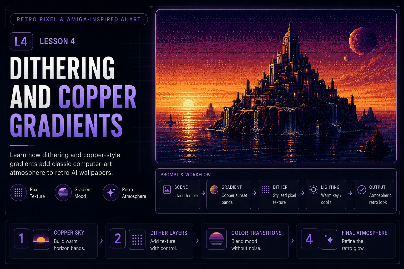
Dithering and Copper Gradients
Dithering and copper-style gradients are two of the most recognizable ingredients in retro computer art. They help an image feel atmospheric, limited, and intentionally designed instead of smooth, modern, and over-rendered.
In this lesson, you will learn how to describe these effects in AI prompts and how to use them carefully for Skinbase-ready retro wallpapers.
What Is Dithering?
Dithering is a visual technique that uses small patterns of pixels to blend colors, soften shadows, or create the illusion of extra tones. Instead of a perfectly smooth gradient, a dithered image has visible pixel texture.
For retro AI art, dithering can help create:
-
softer color transitions
-
classic computer-art texture
-
controlled shadow detail
-
a less modern surface
-
stronger pixel-art atmosphere
The important word is controlled. Dithering should not look like random noise.
Good Dithering Prompt Language
Use phrases that suggest clean texture and intentional pixel transitions.
Good phrases:
text subtle dithering controlled pixel texture clean dithered shadows classic computer-art dithering soft dithered gradient transitions pixel-pattern shading
These phrases tell the AI that the texture should support the artwork.
Dithering Phrases to Avoid
Some words can make the image look damaged or messy.
Use carefully or avoid:
text heavy noise random pixels glitch texture dirty pixels broken image corrupted surface
Those can be useful for glitch art, but they are not ideal for clean Amiga-inspired wallpaper art.
What Are Copper-Style Gradients?
Copper-style gradients are inspired by the dramatic horizontal color bands often associated with classic computer visuals and demoscene screens. In AI artwork, this usually means a sky, horizon, or background with strong banded color transitions.
For this course, copper-style gradients are used as a visual inspiration, not as a strict hardware simulation.
They work well for:
-
sunset skies
-
sci-fi horizons
-
fantasy islands
-
abstract backgrounds
-
demoscene-inspired scenes
-
wallpaper backdrops
A copper-style gradient can make even a simple scene feel dramatic and nostalgic.
Good Copper Gradient Prompt Language
Useful phrases:
text copper-style sunset gradient horizontal gradient bands violet-to-orange sky banded retro sky gradient glowing copper horizon classic computer gradient atmosphere
Example:
text A fantasy island under a violet-to-orange copper-style sunset gradient, retro 16-bit inspired computer art, subtle dithering, clean silhouette, reflective water, wallpaper composition.
Combine Dithering and Gradients
Dithering and gradients work best together when the gradient is beautiful but not too smooth.
Weak direction:
text smooth cinematic sunset with lots of colors and realistic lighting
Better direction:
text copper-style sunset gradient with subtle dithered transitions, limited violet, orange, and gold palette, classic computer-art atmosphere
The second prompt keeps the retro discipline.
Use Dithering in the Right Places
Dithering does not need to appear everywhere. Use it where it helps.
Good places for dithering:
-
sky gradients
-
shadow areas
-
water reflections
-
distant mountains
-
fog or atmosphere
-
soft glow transitions
Avoid applying heavy dithering to every object. If everything is textured, the image can become noisy and hard to read.
Use Copper Gradients for Mood
A copper-style gradient is not only decoration. It sets the emotional tone of the wallpaper.
Different gradient moods:
Warm Fantasy Mood
text violet-to-orange copper sunset gradient, warm gold horizon, dark purple island silhouette
Best for fantasy islands, temples, castles, and reflective water.
Sci-Fi Demoscene Mood
text black-to-purple gradient sky, cyan horizon glow, magenta bands, neon grid floor
Best for abstract scenes, chrome objects, grids, and futuristic cities.
Alien Atmosphere
text dark teal-to-lime gradient sky, violet shadows, yellow horizon glow, dithered alien atmosphere
Best for planets, moons, crystals, and strange landscapes.
Full Prompt Example
text A futuristic island city rises from dark reflective water under a violet-to-orange copper-style sunset gradient, retro 16-bit inspired computer art, limited navy, violet, cyan, and copper palette, chunky pixel structure, subtle dithering, clean dithered sky transitions, strong island silhouette, demoscene-inspired atmosphere, wallpaper composition, no text, no logos, no watermark, no photorealism.
This prompt uses dithering and copper gradients as atmosphere tools, not as random effects.
Before and After Prompt Improvement
Weak prompt:
text retro pixel sunset island, colorful, detailed, glowing, pixelated, 4k
Improved prompt:
text A lonely fantasy island under a copper-style sunset sky, retro 16-bit inspired computer art, limited violet, orange, and gold palette, horizontal gradient bands, subtle dithering, clean pixel structure, reflective water, strong silhouette, wallpaper-friendly composition, no text, no logos, no photorealism.
The improved prompt is better because it describes:
-
the subject
-
the palette
-
the gradient style
-
the texture
-
the composition
-
the restrictions
Common Problems and Fixes
Problem: The image looks too smooth
Add:
text subtle dithering, dithered gradient transitions, classic computer-art texture
Problem: The image looks too noisy
Add:
text controlled dithering, clean pixel structure, not noisy, not cluttered
Problem: The sky looks too modern
Add:
text horizontal gradient bands, copper-style sky, limited palette, retro computer gradient atmosphere
Problem: The image has too many colors
Add:
text limited palette, restrained highlights, 32-color inspired color discipline
Mini Exercise
Create three versions of the same scene:
Base scene:
text A retro sci-fi island city over reflective water.
Version 1:
text Use a violet-to-orange copper sunset gradient with subtle dithering.
Version 2:
text Use a dark purple-to-cyan demoscene gradient with neon grid reflections.
Version 3:
text Use a dark teal-to-lime alien gradient with dithered shadows.
Compare the results. The subject stays the same, but the gradient and dithering change the mood.
Quality Checklist
Before moving to the next lesson, check your prompt:
-
Did you use dithering as controlled texture?
-
Did you avoid random noise language?
-
Did you describe the gradient direction or color mood?
-
Did the gradient support the subject?
-
Did you keep the palette limited?
-
Does the image still read clearly as a wallpaper thumbnail?
Lesson Outcome
By the end of this lesson, you should be able to use dithering and copper-style gradients to create more atmospheric, controlled, and retro-feeling AI wallpapers.
Lesson navigation
Continue in order
Previous lesson
Retro Pixel & Amiga-Inspired AI Art · Lesson 03
Limited Palettes and Color Discipline
Learn how focused color palettes make retro AI wallpapers feel more authentic, readable, and controlled.
Next lesson
Retro Pixel & Amiga-Inspired AI Art · Lesson 05
Wallpaper Composition for Retro AI Art
Learn how to compose retro AI images that remain clean, readable, and useful as wallpapers.