Latest Comments

List of artwork with latest comments recieved.

2 decades ago
Comment by: brain4
PC Magazine
is the excellent work we lyke alls 8)
2 decades ago
Comment by: luci
Etched Glass
nice work!
message for brain4: ´i really never understood that guy!´ - hoborg, the neverhood chronicles lol
2 decades ago
Comment by: Scarebear
PC Magazine
Oh, HVD of course looks great too. Didn´t mean to leave that out Happy
2 decades ago
Comment by: Scarebear
PC Magazine
Awesome looking WindowBlinds, Winamp and ICQ skins. I hope there´s a WinStep pack too in this suite Happy It´s all beautiful (as usual). And good to see Sonique still in your media player list Wink
2 decades ago
Comment by: Scarebear
Critical Mass v2
And very cool too Happy Great job matey!
2 decades ago
Comment by: Snowman
PC Magazine
Stunning work as always!!
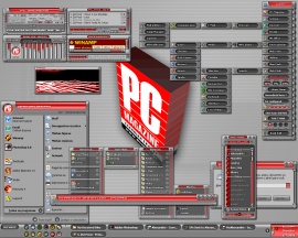
...and it is of course an exclusive suite, not for download anywhere?!?!
2 decades ago
Comment by: Valhalla
PC Magazine
Looks absolutely sensational.
2 decades ago
Comment by: Valhalla
Z
Missed this one before.
Quite exquisite, Alex!
Thank you!
Happy
2 decades ago
Comment by: BruB
demagogue
This is very nice and I like the "blob" on the left! Good work
2 decades ago
Comment by: Valhalla
Tab_ccap
Quality, Randy. Pure quality.
Thank you. Happy
2 decades ago
Comment by: BruB
Xpaper
I like the X effect. Good job Koa!
2 decades ago
Comment by: brain4
the Wood
we lyke alls nyce colors is the alls good work
2 decades ago
Comment by: brain4
Etched Glass
we lyke the centers and the greye colors to the rond so whit the colors textures is by betters so is the good work
2 decades ago
Comment by: brain4
Etched Glass
we lyke the centers and the greye colors to the rond so whit the colors textures is by betters so is the good work
2 decades ago
Comment by: Elwin
Quiddity3
That´s a stone groove man... {:p
2 decades ago
Comment by: Elwin
Tab_ccap
Great Job, Koa!
2 decades ago
Comment by: Blusknrule
Ares2
Wow this is nice - super clean and smooth hi-tek design. About the only thing keeping it from me rating it at 100% is that the lettering is too light and too small to see on a 1024 X 768 monitor.
2 decades ago
Comment by: sed
Ashanti
love the etal sort of TWIST and the lighting
Great work Greater color /sed:
2 decades ago
Comment by: adni18
Welcome
LOL hehe, Elwin, thank you Happy
2 decades ago
Comment by: Elwin
Welcome
Quite Lovely!

Almost makes me want to upgrade to XP.
Almost...
Happy