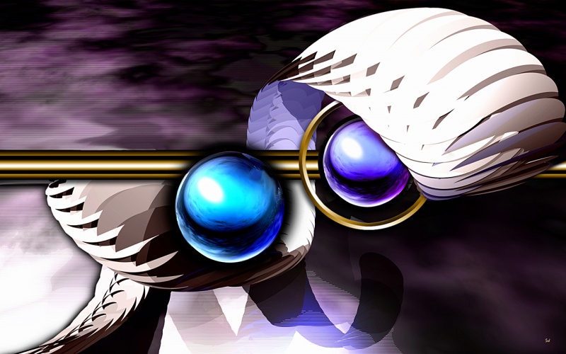
DeZign 479
By sedMay be a bit over saturated to some Zoom it and let me know..
Different strokes for diff folks etc......
all sizes in zip....

Comments:

1 decade ago
Comment by: FredNunes
Great job. But I do think that blue sphere middle is a bit bright.. just my take. I do not make these but I know good art. Love the design! 

1 decade ago
Comment by: teddybearcholla
To me it gives it a *painterly* look. I like it. It is good to experiment and go beyond your comfort zone. 

1 decade ago
Comment by: Alfa30

1 decade ago
Comment by: Richard Mohler

1 decade ago
Comment by: digitalpix4all
Good work, sed. 

1 decade ago
Comment by: jazzilady
It´s different, and that´s not a bad thing! It´s always fun to try something new! 
1 decade ago
Comment by: killua
Nice Sed

Comment by: AzDude
might be a bit better - it´s cool though
AzDude ( Mike )