
Me 3
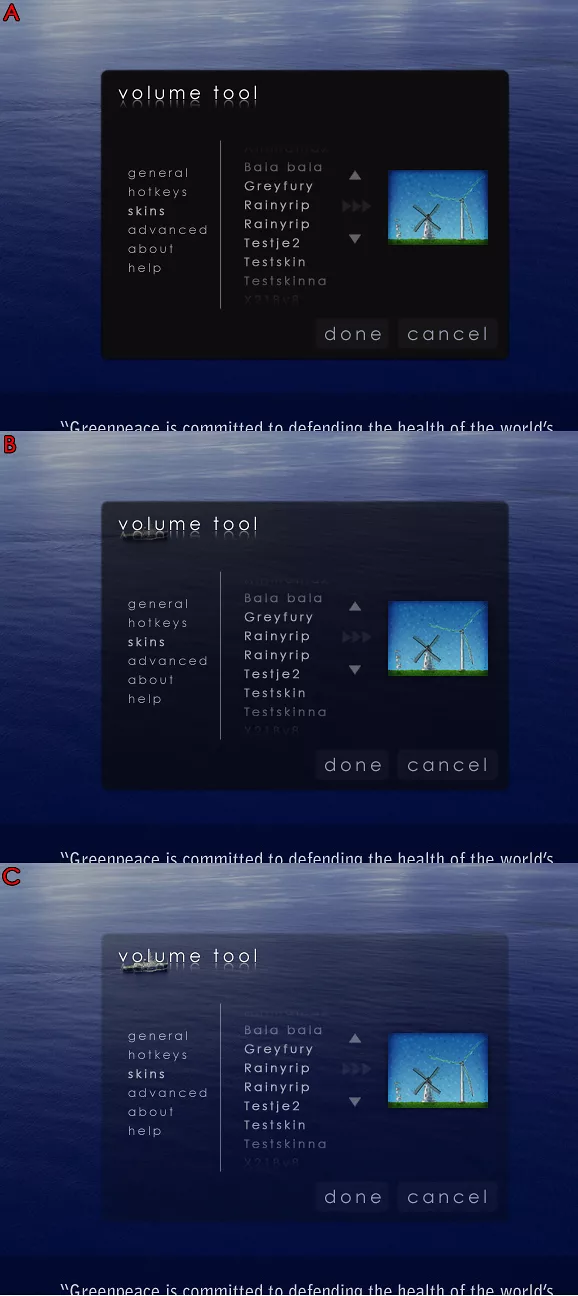
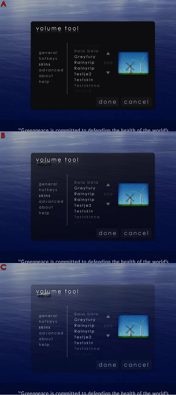
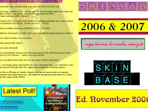
This screenshot composite shows the configuration dialog of a little skinnable app im working on. I have been looking at this darn picture for the last 20 minutes, wondering which of the three (a, b, c) is the "nicest" and would work best for most people (taking in account various backgrounds etc). Please give me your thoughts on this (which of the three and especially: why?!). Some feedback would be great :)
Drop a reaction so other people instantly see whether this piece hits with love, fire, wow, or a quick clap.
Last one will die on light screens. Other two are even. E-mail me when you have a working beta. You know what I´ll do then. 8)
Sign in to join the conversation.


We use essential cookies to keep you logged in and protect your session. With your permission we also load advertising cookies from third-party networks. Learn more ↗