
volume tool
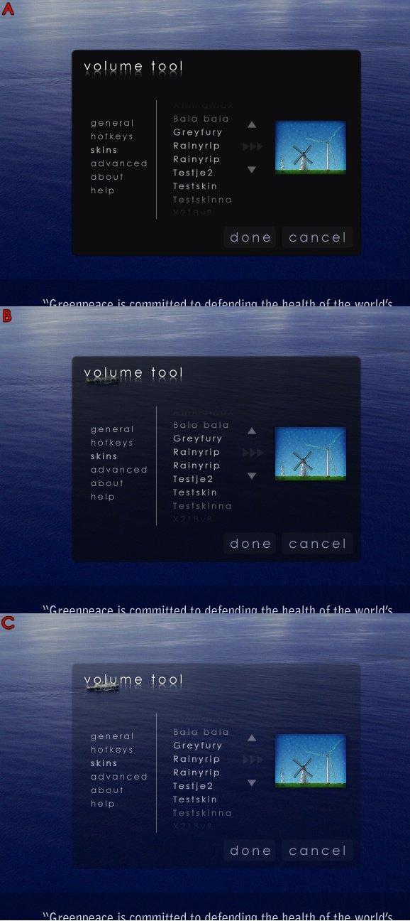
By PKThis screenshot composite shows the configuration dialog of a little skinnable app im working on. I have been looking at this darn picture for the last 20 minutes, wondering which of the three (a, b, c) is the "nicest" and would work best for most people (taking in account various backgrounds etc). Please give me your thoughts on this (which of the three and especially: why?!). Some feedback would be great

Comments:

1 decade ago
Comment by: MountainHawk
A and B are so close they may as well be the same. The lower one is in transparency which fits what most people are getting into. My thought is to produce one with transparency option and then it covers all bases.....Hope I helped PK! 


1 decade ago
Comment by: CutTheRedWire
Last one will die on light screens. Other two are even. E-mail me when you have a working beta. You know what I´ll do then. 8)
1 decade ago
Comment by: PK
A working beta... don´t expect anything anytime soon ;-)
1 decade ago
Comment by: CutTheRedWire
I gotcha. I gotcha. 8)
1 decade ago
Comment by: PK
Good ;-)

Comment by: PK
http://www.blametheancientgreeks.info